| Line 182: | Line 182: | ||
=Rendering Intent= | =Rendering Intent= | ||
| + | (Source: http://en.wikipedia.org/wiki/Color_management#Rendering_intent) | ||
| + | When the gamut of source color space exceeds that of the destination, saturated colors are liable to become clipped (inaccurately represented), or more formally burned. The color management module can deal with this problem in several ways. The ICC specification includes four different rendering intents: | ||
| + | * Absolute colorimetric | ||
| + | * Relative colorimetric | ||
| + | * Perceptual | ||
| + | * Saturation. | ||
| + | ==Absolute Colorimetric== | ||
| + | Absolute colorimetry and relative colorimetry actually use the same table but differ in the adjustment for the white point media. If the output device has a much larger gamut than the source profile, i.e., all the colors in the source can be represented in the output, using the absolute colorimetry rendering intent would "ideally" (ignoring noise, precision, etc.) give an exact output of the specified [[Colorimetry#CIE_LAB|CIELAB]] values. Perceptually, the colors may appear incorrect, but instrument measurements of the resulting output would match the source. Colors outside of the proof print system's possible color are mapped to the boundary of the color gamut. Absolute colorimetry is useful to get an exact specified color (e.g., IBM blue), or to quantify the accuracy of mapping methods. | ||
| + | |||
| + | |||
| + | According to the Photoshop definition: | ||
| + | |||
| + | Attempts to match the absolute Lab coordinates of the destination colors to the absolute Lab coordinates of the source colors. Does not adjust for different media white points. Mostly used for "logo" colors and hard proofing. | ||
| + | |||
| + | |||
| + | ==Relative Colorimetric== | ||
| + | The goal in relative colorimetry is to be truthful to the specified color, with only a correction for the media. Relative colorimetry is useful in proofing applications, since you are using it to get an idea of how a print on one device will appear on a different device. Media differences are the only thing you really would like to adjust for. Obviously there has to be some gamut mapping going on also. Usually this is done in a way where hue and lightness are maintained at the cost of reduced saturation. Relative colorimetric is the default rendering intent on most systems. | ||
| + | |||
| + | |||
| + | According to the Photoshop definition: | ||
| + | |||
| + | Attempts to match the media-relative Lab coordinates of the destination colors to the media-relative Lab coordinates of the source colors. The source white point is mapped to the destination white point. Recommended for most conversions, especially when most source colors are already inside the destination gamut. | ||
| + | |||
| + | |||
| + | ==Perceptual and Saturation== | ||
| + | The perceptual and saturation intents are where the results really depend upon the profile maker. This is even how some of the competitors in this market differentiate themselves. These intents should be created by the profile maker so that pleasing images occur with the perceptual intent while eye-catching business graphics occur with the saturation intent. This is achieved through the use of different perceptual remaps of the data as well as different gamut mapping methods. Perceptual rendering is recommended for color separation. | ||
| + | |||
| + | |||
| + | In practice, photographers almost always use relative or perceptual intent, as for natural images, absolute causes color cast, while saturation produces unnatural colors. Relative intent handles out-of-gamut by clipping (burning) these colors to the edge of the gamut, leaving in-gamut colors unchanged, while '''perceptual intent smoothly moves out-of-gamut colors into gamut, preserving gradations, but distorts in-gamut colors in the process'''. If an entire image is in-gamut, relative is perfect, but when there are out of gamut colors, which is more preferable depends on a case-by-case basis. | ||
| + | |||
| + | '''Saturation intent is most useful in charts and diagrams''', where there is a discrete palette of colors which one wishes to have saturated (to "pop"), but where the specific hue is less important. | ||
| + | |||
| + | |||
| + | According to the Photoshop definition: | ||
| + | |||
| + | Perceptual: Requests a visually pleasing rendering, preserving the visual relationships between source colors. Often used to render wide gamut source images, where preserving the relationship of colors inside and outside the destination gamut is more important than exactly matching the colors inside the destination gamut. | ||
| + | |||
| + | Saturation: Requests a highly saturated rendering, at the possible expense of color accuracy. Mostly used for business graphics (Pies, Charts, etc.), where color accuracy is less important than having a highly saturated result. | ||
Revision as of 20:49, 1 January 2012
Contents
Color Spaces
A color space is the 3-dimensional space in which colors can be represented. 3 dimensions are enough for all applications to describe a color faithfully, but various conventions can be chosen to select each dimension depending on the intended goal (processing, display, accuracy, perception, etc.).
Some of the color spaces are CIE XYZ, CIE xyY, CIE LAB, RGB, HSV, HSB, HSL, YUV.
These color spaces can be categorized in different ways:
- Device independent or Absolute color spaces like XYZ, xyY or Lab
- Device dependent or non-Absolute color spaces like RGB, HSV, HSL, HSB and YUV
Or:
- RGB-based color spaces like XYZ, RGB
- Non RGB-Based color spaces like HSV, HSL, HSB, YUV, Lab
Absolute Color Space
(Source: http://en.wikipedia.org/wiki/Absolute_color_space)
In color science, there are two meanings of the term absolute color space:
- A color space in which the perceptual difference between colors is directly related to distances between colors as represented by points in the color space.
- A color space in which colors are unambiguous, that is, where the interpretations of colors in the space are colorimetrically defined without reference to external factors.
In this section, we concentrate on the second definition.
CIEXYZ and sRGB are examples of absolute color spaces, as opposed to a generic RGB color space.
A non-absolute color space can be made absolute by defining its relationship to absolute colorimetric quantities. For instance, if the red, green, and blue colors in a monitor are measured exactly, together with other properties of the monitor, then RGB values on that monitor can be considered as absolute. The L*a*b* is sometimes referred to as absolute, though it also needs a white point specification to make it so.
A popular way to make a color space like RGB into an absolute color is to define an ICC profile, which contains the attributes of the RGB. This is not the only way to express an absolute color, but it is the standard in many industries. RGB colors defined by widely accepted profiles include sRGB and Adobe RGB. The process of adding an ICC profile to a graphic or document is sometimes called tagging or embedding; tagging therefore marks the absolute meaning of colors in that graphic or document.
Conversion
A color in one absolute color space can be converted into another absolute color space, and back again, in general; however, some color spaces may have gamut limitations, and converting colors that lie outside that gamut will not produce correct results. There are also likely to be rounding errors, especially if the popular range of only 256 distinct values per component (8-bit color) is used.
One part of the definition of an absolute color space is the viewing conditions. The same color, viewed under different natural or artificial lighting conditions, will look different. Those involved professionally with color matching may use viewing rooms, lit by standardized lighting.
Occasionally, there are precise rules for converting between non-absolute color spaces. For example HSL and HSV spaces are defined as mappings of RGB. Both are non-absolute, but the conversion between them should maintain the same color. However, in general, converting between two non-absolute color spaces (for example, RGB to CMYK) or between absolute and non-absolute color spaces (for example, RGB to L*a*b*) is almost a meaningless concept.
Standard Observer
(Source: http://en.wikipedia.org/wiki/CIE_1931_color_space#The_CIE_standard_observer)
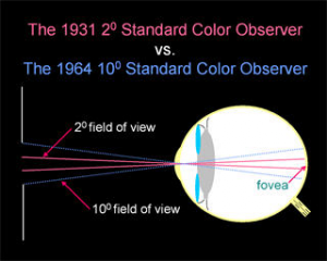
Due to the distribution of cone cells in the eye, the tristimulus values depend on the observer's field of view. To eliminate this variable, the CIE defined the standard (colorimetric) observer. Originally this was taken to be the chromatic response of the average human viewing through a 2° angle, due to the belief that the color-sensitive cones resided within a 2° arc of the fovea. Thus the CIE 1931 Standard Observer is also known as the CIE 1931 2° Standard Observer. A more modern but less-used alternative is the CIE 1964 10° Standard Observer.
For the 10° experiments, the observers were instructed to ignore the central 2° spot. The 1964 Supplementary Standard Observer is recommended for more than about a 4° field of view. Both standard observers are discretized at 5 nm wavelength intervals and distributed by the CIE.
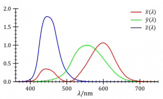
The standard observer is characterized by three color matching functions.
The derivation of the CIE standard observer from color matching experiments is given below, after the description of the CIE RGB space.
Color matching functions
The color matching functions are the numerical description of the chromatic response of the observer (described above).
The CIE has defined a set of three color-matching functions, called <math>\overline{x}(\lambda)</math>, <math>\overline{y}(\lambda)</math>, and <math>\overline{z}(\lambda)</math>, which can be thought of as the spectral sensitivity curves of three linear light detectors that yield the CIE XYZ tristimulus values X, Y, and Z. The tabulated numerical values of these functions are known collectively as the CIE standard observer.
The tristimulus values for a color with a spectral power distribution <math>I(\lambda)\,</math> are given in terms of the standard observer by:
- <math>X= \int_0^\infty I(\lambda)\,\overline{x}(\lambda)\,d\lambda</math>
- <math>Y= \int_0^\infty I(\lambda)\,\overline{y}(\lambda)\,d\lambda</math>
- <math>Z= \int_0^\infty I(\lambda)\,\overline{z}(\lambda)\,d\lambda</math>
where <math>\lambda\,</math> is the wavelength of the equivalent monochromatic light (measured in nanometers).
Other observers, such as for the CIE RGB space or other RGB color spaces, are defined by other sets of three color-matching functions, and lead to tristimulus values in those other spaces.
The values of X, Y, and Z are bounded if the intensity spectrum I(λ) is bounded.
Device-Independent Color Spaces
These color spaces can also be used as Profile Connection Space (PCS).
Color Space 1 → PCS (CIELAB or CIEXYZ) → Color space 2; conversions into and out of the PCS are each specified by a color profile.
CIE XYZ
The CIE 1931 XYZ color space is one of many RGB color spaces, distinguished by a particular set of monochromatic (single-wavelength) primary colors.
The XYZ color space should be considered the master color space as it can encompass and describe all other RGB color spaces. It's also independent of any device and is a reference space.
You can check this very educational video for a visual explanation of what is XYZ as opposed to standard RGB : http://www.youtube.com/watch?v=x0-qoXOCOow
The human eye has photoreceptors called cone cells for medium- and high-brightness color vision, with sensitivity peaks in short (S, 420–440 nm), middle (M, 530–540 nm), and long (L, 560–580 nm) wavelengths.
In the CIE XYZ color space, the tristimulus values are not the S, M, and L responses of the human eye, but rather a set of tristimulus values called X, Y, and Z, which are roughly red, green and blue, respectively (note that the X,Y,Z values are not physically observed red, green, blue colors. Rather, they may be thought of as 'derived' parameters from the red, green, blue colors).
CIE xyY
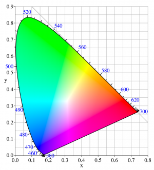
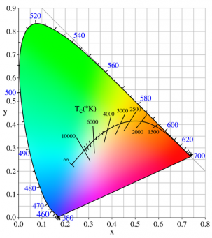
All around this compendium, you will find many images that look like the thumbnail to the right.
This is called the chromaticity diagram and is represented in the xyY color space, not to be confused with the XYZ color space seen above, although both are tightly related through simple linear transforms.
The concept of color can be divided into two parts: brightness (or luminance) and chromaticity. For example, the color white is a bright color, while the color grey is considered to be a less bright version of that same white. In other words, the chromaticity of white and grey are the same while their brightness differs.
The CIE XYZ color space was deliberately designed so that the Y parameter was a measure of the brightness or luminance of a color. The chromaticity of a color was then specified by the two derived parameters x and y, two of the three normalized values which are functions of all three tristimulus values X, Y, and Z:
- <math>x = \frac{X}{X+Y+Z}</math>
- <math>y = \frac{Y}{X+Y+Z}</math>
- <math>z = \frac{Z}{X+Y+Z} = 1 - x - y</math>
The derived color space specified by x, y, and Y is known as the CIE xyY color space and is widely used to specify colors in practice.
The X and Z tristimulus values can be calculated back from the chromaticity values x and y and the Y tristimulus value:
- <math>X=\frac{Y}{y}x</math>
- <math>Z=\frac{Y}{y}(1-x-y)</math>
CIE LAB
(Source: http://en.wikipedia.org/wiki/Lab_color_space)
A Lab color space is a color-opponent space with dimension L for lightness and a and b for the color-opponent dimensions, based on nonlinearly compressed CIE XYZ color space coordinates.
There are 2 "versions" of the LAB color spaces (both are related in purpose, but differ in implementation):
- The Hunter 1948 (L,a,b) color space version
- The CIE 1976 (L*,a*,b*) color space version which is now widely used and called CIELAB or even Lab despite the fact the Lab coordinates actually refer to L*,a*,b* coordinates.
The intention of the "Lab" color space is to create a space which can be computed via simple formulas from the XYZ space, but is more perceptually uniform than XYZ. Perceptually uniform means that a change of the same amount in a color value should produce a change of about the same visual importance. When storing colors in limited precision values, this can improve the reproduction of tones. Lab space is relative to the white point of the XYZ data they were converted from. Lab values do not define absolute colors unless the white point is also specified. Often, in practice, the white point is assumed to follow a standard and is not explicitly stated (e.g., for "absolute colorimetric" rendering intent ICC L*a*b* values are relative to CIE standard illuminant D50, while they are relative to the unprinted substrate for other rendering intents).
The L*a*b* color space includes all perceivable colors which means that its gamut exceeds those of the RGB and CMYK color models. One of the most important attributes of the L*a*b*-model is the device independency. This means that the colors are defined independent of their nature of creation or the device they are displayed on. The L*a*b* color space is used e.g. in Adobe Photoshop when graphics for print have to be converted from RGB to CMYK, as the L*a*b* gamut includes both the RGB and CMYK gamut. Also it is used as an interchange format between different devices as for its device independency.
Unlike the RGB and CMYK color models, Lab color is designed to approximate human vision. It aspires to perceptual uniformity, and its L component closely matches human perception of lightness. It can thus be used to make accurate color balance corrections by modifying output curves in the a and b components, or to adjust the lightness contrast using the L component.
On the other hand, RGB or CMYK spaces model the output of physical devices rather than human visual perception.
Device-Dependent Color Spaces
RGB
You are certainly familiar with the RGB color space. It's the most widely used color space and, as a graphics programmer, it's the one we are dealing with everyday whether it's stored in image files or used in runtime textures. Also, 3D renderers and shaders exclusively deal with RGB values.
Despite its familiarity, it is not obvious to understand that RGB is not a device-independent format but is strongly tainted by the various stages of the color pipeline an image goes through, from acquisition to display (see also Absolute Color Space.
Also, RGB represents a limited part of the entire color gamut which is represented by the horseshoe chromaticity diagram of the xyY color space described earlier.
It's important to understand that a RGB color is inherently tied to a Color Profile and cannot be interpreted as a standalone color.
To be perfectly accurate, a RGB color should be transformed into the master XYZ color space thanks to its color profile data which will then yield a device-independent color.
Conversely, the device-independent XYZ color can then be transformed back into RGB with maybe some other associated color profile. For example, to be stored to disk or printed out.
Transformation of device-dependent colors into XYZ and back again is the role of a Color Management System, such systems are embedded in various Operating Systems but also in softwares like Adobe Photoshop.
You can find various transform operations from device-dependent color spaces to XYZ here : Color Transforms
HSL and HSV
(Source: http://en.wikipedia.org/wiki/HSL_and_HSV)
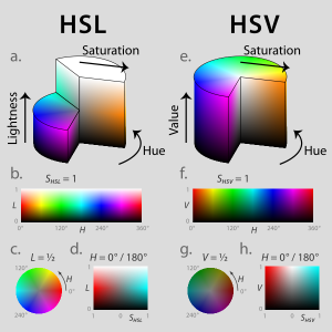
HSL and HSV are the two most common cylindrical-coordinate representations of points in an RGB color model, which rearrange the geometry of RGB in an attempt to be more intuitive and perceptually relevant than the cartesian (cube) representation. They were developed in the 1970s for computer graphics applications, and are used for color pickers, in color-modification tools in image editing software, and less commonly for image analysis and computer vision.
HSL stands for hue, saturation, and lightness, and is often also called HLS. HSV stands for hue, saturation, and value, and is also often called HSB (B for brightness). A third model, common in computer vision applications, is HSI, for hue, saturation, and intensity. Unfortunately, while typically consistent, these definitions are not standardized, and any of these abbreviations might be used for any of these three or several other related cylindrical models.
In each cylinder, the angle around the central vertical axis corresponds to "hue", the distance from the axis corresponds to "saturation", and the distance along the axis corresponds to "lightness", "value" or "brightness". Note that while "hue" in HSL and HSV refers to the same attribute, their definitions of "saturation" differ dramatically. Because HSL and HSV are simple transformations of device-dependent RGB models, the physical colors they define depend on the colors of the red, green, and blue primaries of the device or of the particular RGB space, and on the gamma correction used to represent the amounts of those primaries. Each unique RGB device therefore has unique HSL and HSV spaces to accompany it, and numerical HSL or HSV values describe a different color for each basis RGB space.
Please refer to the Color Transforms page for useful transformations between color spaces.
YUV
YUV is essentially a format used for analog video and broadcasting and won't be discussed here. Please refer to http://en.wikipedia.org/wiki/YUV for information about YUV, YCbCr and the many standards that were devised across the history of television.
Difference between Color Space and Color Profile
It's important not to confuse the RGB Color Spaces described earlier with some Color Profiles like sRGB or Adobe RGB.
The latter are color profiles that describe how to map a RGB value to the entire gamut of chromaticities and how to interpret the luminance (linear or gamma-corrected).
Rendering Intent
(Source: http://en.wikipedia.org/wiki/Color_management#Rendering_intent)
When the gamut of source color space exceeds that of the destination, saturated colors are liable to become clipped (inaccurately represented), or more formally burned. The color management module can deal with this problem in several ways. The ICC specification includes four different rendering intents:
- Absolute colorimetric
- Relative colorimetric
- Perceptual
- Saturation.
Absolute Colorimetric
Absolute colorimetry and relative colorimetry actually use the same table but differ in the adjustment for the white point media. If the output device has a much larger gamut than the source profile, i.e., all the colors in the source can be represented in the output, using the absolute colorimetry rendering intent would "ideally" (ignoring noise, precision, etc.) give an exact output of the specified CIELAB values. Perceptually, the colors may appear incorrect, but instrument measurements of the resulting output would match the source. Colors outside of the proof print system's possible color are mapped to the boundary of the color gamut. Absolute colorimetry is useful to get an exact specified color (e.g., IBM blue), or to quantify the accuracy of mapping methods.
According to the Photoshop definition:
Attempts to match the absolute Lab coordinates of the destination colors to the absolute Lab coordinates of the source colors. Does not adjust for different media white points. Mostly used for "logo" colors and hard proofing.
Relative Colorimetric
The goal in relative colorimetry is to be truthful to the specified color, with only a correction for the media. Relative colorimetry is useful in proofing applications, since you are using it to get an idea of how a print on one device will appear on a different device. Media differences are the only thing you really would like to adjust for. Obviously there has to be some gamut mapping going on also. Usually this is done in a way where hue and lightness are maintained at the cost of reduced saturation. Relative colorimetric is the default rendering intent on most systems.
According to the Photoshop definition:
Attempts to match the media-relative Lab coordinates of the destination colors to the media-relative Lab coordinates of the source colors. The source white point is mapped to the destination white point. Recommended for most conversions, especially when most source colors are already inside the destination gamut.
Perceptual and Saturation
The perceptual and saturation intents are where the results really depend upon the profile maker. This is even how some of the competitors in this market differentiate themselves. These intents should be created by the profile maker so that pleasing images occur with the perceptual intent while eye-catching business graphics occur with the saturation intent. This is achieved through the use of different perceptual remaps of the data as well as different gamut mapping methods. Perceptual rendering is recommended for color separation.
In practice, photographers almost always use relative or perceptual intent, as for natural images, absolute causes color cast, while saturation produces unnatural colors. Relative intent handles out-of-gamut by clipping (burning) these colors to the edge of the gamut, leaving in-gamut colors unchanged, while perceptual intent smoothly moves out-of-gamut colors into gamut, preserving gradations, but distorts in-gamut colors in the process. If an entire image is in-gamut, relative is perfect, but when there are out of gamut colors, which is more preferable depends on a case-by-case basis.
Saturation intent is most useful in charts and diagrams, where there is a discrete palette of colors which one wishes to have saturated (to "pop"), but where the specific hue is less important.
According to the Photoshop definition:
Perceptual: Requests a visually pleasing rendering, preserving the visual relationships between source colors. Often used to render wide gamut source images, where preserving the relationship of colors inside and outside the destination gamut is more important than exactly matching the colors inside the destination gamut.
Saturation: Requests a highly saturated rendering, at the possible expense of color accuracy. Mostly used for business graphics (Pies, Charts, etc.), where color accuracy is less important than having a highly saturated result.
Black Body
(source http://en.wikipedia.org/wiki/Planck%27s_law)
A black body is an idealized physical body that absorbs all incident electromagnetic radiation. Because of this perfect absorptivity at all wavelengths, a black body is also the best possible emitter of thermal radiation, which it radiates incandescently in a characteristic, continuous spectrum that depends on the body's temperature. At Earth-ambient temperatures this emission is in the infrared region of the electromagnetic spectrum and is not visible. The object appears black, since it does not reflect or emit any visible light.
The thermal radiation from a black body is energy converted electrodynamically from the body's pool of internal thermal energy at any temperature greater than absolute zero. It is called blackbody radiation and has a frequency distribution with a characteristic frequency of maximum radiative power that shifts to higher frequencies with increasing temperature. As the temperature increases past a few hundred degrees Celsius, black bodies start to emit visible wavelengths, appearing red, orange, yellow, white, and blue with increasing temperature. When an object is visually white, it is emitting a substantial fraction as ultraviolet radiation.
In terms of wavelength (λ), Planck's law is written:
- <math>B_\lambda(T) =\frac{2 hc^2}{\lambda^5}\frac{1}{ e^{\frac{hc}{\lambda k_\mathrm{B}T}} - 1}</math>
where B is the spectral radiance, T is the absolute temperature of the black body, kB is the Boltzmann constant, h is the Planck constant, and c is the speed of light.
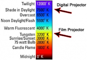
| Temperature | Source |
|---|---|
| 1,700 K | Match flame |
| 1,850 K | Candle flame, sunset/sunrise |
| 2,700–3,300 K | Incandescent light bulb |
| 3,200 K | Studio lamps, photofloods, etc. |
| 3,350 K | Studio "CP" light |
| 4,100–4,150 K | Moonlight, xenon arc lamp |
| 5,000 K | Horizon daylight |
| 5,500–6,000 K | Vertical daylight, electronic flash |
| 6,500 K | Daylight, overcast |
| 6,500–9,300 K | LCD or CRT screen |
| These temperatures are merely characteristic; considerable variation may be present. | |
CIE Illuminants
Used for :
- Describing general lighting conditions (when taking a picture, or displaying one).
- Spectral characteristics similar to natural light sources
- Reproducible in the laboratory
The white point of an illuminant is the chromaticity of a white object under the illuminant.
1931 Illuminants
- Illuminant A = Typical Incandescent Light (2856 K)
- Illuminant B = Direct Sunlight
- Illuminant C = Average daylight from total sky (ambient sky light)
1963 Illuminants
- Illuminant D = Phases of daylight.
- Necessarily followed by the first 2 digits of the CCT (e.g. D65 = D 6504K)
- Represent daylight more completely and accurately than do Illuminants B and C because the spectral distributions for the D Illuminants have been defined across the ultraviolet (UV), visible, and near-infrared (IR) wavelengths (300–830 nm).
- Most industries use D65 when daylight viewing conditions are required
- D50 is used by graphic arts industry => more spectrally balanced across spectrum
Please refer to the D Illuminant Computation page for an interesting way of computing the SPD from CCT.
Other Illuminants
- Illuminant E = Equal energy illuminant
- Illuminant F = Fluorescent lamps of different composition.
- F1–F6 "standard" fluorescent lamps consist of two semi-broadband emissions of antimony and manganese activations in calcium halophosphate phosphor.
- F4 is of particular interest since it was used for calibrating the CIE Color Rendering Index (the CRI formula was chosen such that F4 would have a CRI of 51).
- F7–F9 are "broadband" (full-spectrum light) fluorescent lamps with multiple phosphors, and higher CRIs.
- F10–F12 are narrow triband illuminants consisting of three "narrowband" emissions (caused by ternary compositions of rare-earth phosphors) in the R,G,B regions of the visible spectrum. The phosphor weights can be tuned to achieve the desired CCT.
White Point
The white point is a very important data as it defines the color "white" in image capture, encoding, or reproduction. Depending on the application, different definitions of white are needed to give acceptable results. For example, photographs taken indoors may be lit by incandescent lights, which are relatively orange compared to daylight. Defining "white" as daylight will give unacceptable results when attempting to color correct a photograph taken with incandescent lighting.
Illuminant and white point are separate concepts. For a given illuminant, its white point is uniquely defined. A given white point, on the other hand, generally does not uniquely correspond to only one illuminant. From the commonly used CIE 1931 chromaticity diagram, it can be seen that almost all non-spectral colors, including colors described as white, can be produced by infinitely many combinations of spectral colors, and therefore by infinitely many different illuminant spectra.
(source from http://en.wikipedia.org/wiki/Standard_illuminant#White_point)
The spectrum of a standard illuminant, like any other profile of light, can be converted into tristimulus values. The set of three tristimulus coordinates of an illuminant is called a white point. If the profile is normalised, then the white point can equivalently be expressed as a pair of chromaticity coordinates. If an image is recorded in tristimulus coordinates (or in values which can be converted to and from them), then the white point of the illuminant used gives the maximum value of the tristimulus coordinates that will be recorded at any point in the image, in the absence of fluorescence. It is called the white point of the image. The process of calculating the white point discards a great deal of information about the profile of the illuminant, and so although it is true that for every illuminant the exact white point can be calculated, it is not the case that knowing the white point of an image alone tells you a great deal about the illuminant that was used to record it.
White points of standard illuminants
A list of standardized illuminants, their CIE chromaticity coordinates (x,y) of a perfect reflecting (or transmitting) diffuser, and their correlated color temperatures (CCTs) are given below. The CIE chromaticity coordinates are given for both the 2 degree field of view (1931) and the 10 degree field of view (1964). The color swatches represent the hue of each white point, calculated with luminance Y=0.54 and the standard observer, assuming correct sRGB display calibration.
| Name | CIE 1931 2° | CIE 1964 10° | CCT (K) | Hue | Note | ||
|---|---|---|---|---|---|---|---|
| x2 | y2 | x10 | y10 | ||||
| A | 0.44757 | 0.40745 | 0.45117 | 0.40594 | 2856 | Incandescent / Tungsten | |
| B | 0.34842 | 0.35161 | 0.34980 | 0.35270 | 4874 | {obsolete} Direct sunlight at noon | |
| C | 0.31006 | 0.31616 | 0.31039 | 0.31905 | 6774 | {obsolete} Average / North sky Daylight | |
| D50 | 0.34567 | 0.35850 | 0.34773 | 0.35952 | 5003 | Horizon Light. ICC profile PCS | |
| D55 | 0.33242 | 0.34743 | 0.33411 | 0.34877 | 5503 | Mid-morning / Mid-afternoon Daylight | |
| D65 | 0.31271 | 0.32902 | 0.31382 | 0.33100 | 6504 | Noon Daylight: Television, sRGB color space | |
| D75 | 0.29902 | 0.31485 | 0.29968 | 0.31740 | 7504 | North sky Daylight | |
| E | 1/3 | 1/3 | 1/3 | 1/3 | 5454 | Equal energy | |
| F1 | 0.31310 | 0.33727 | 0.31811 | 0.33559 | 6430 | Daylight Fluorescent | |
| F2 | 0.37208 | 0.37529 | 0.37925 | 0.36733 | 4230 | Cool White Fluorescent | |
| F3 | 0.40910 | 0.39430 | 0.41761 | 0.38324 | 3450 | White Fluorescent | |
| F4 | 0.44018 | 0.40329 | 0.44920 | 0.39074 | 2940 | Warm White Fluorescent | |
| F5 | 0.31379 | 0.34531 | 0.31975 | 0.34246 | 6350 | Daylight Fluorescent | |
| F6 | 0.37790 | 0.38835 | 0.38660 | 0.37847 | 4150 | Lite White Fluorescent | |
| F7 | 0.31292 | 0.32933 | 0.31569 | 0.32960 | 6500 | D65 simulator, Daylight simulator | |
| F8 | 0.34588 | 0.35875 | 0.34902 | 0.35939 | 5000 | D50 simulator, Sylvania F40 Design 50 | |
| F9 | 0.37417 | 0.37281 | 0.37829 | 0.37045 | 4150 | Cool White Deluxe Fluorescent | |
| F10 | 0.34609 | 0.35986 | 0.35090 | 0.35444 | 5000 | Philips TL85, Ultralume 50 | |
| F11 | 0.38052 | 0.37713 | 0.38541 | 0.37123 | 4000 | Philips TL84, Ultralume 40 | |
| F12 | 0.43695 | 0.40441 | 0.44256 | 0.39717 | 3000 | Philips TL83, Ultralume 30 | |
References
An Introduction to Appearance Analysis (2001) http://www.color.org/ss84.pdf
